02/ Kredey: Bridging India's Academic Notes Gap
02/ Kredey: Bridging India's Academic Notes Gap
A mobile-first redesign connecting professors with exam-prep students across India
Product Design
Product Design
SaaS
SaaS
User Testing
User Testing
As the Product Designer at Kredey, I led a comprehensive redesign of their existing EdTech platform that connects students preparing for competitive exams in India with professors' study materials. The original product was struggling with usability issues, poor conversion rates, and scaling limitations. My redesign transformed the user experience and delivered significant measurable improvements across key metrics.
THE CHALLENGE
THE CHALLENGE
The original Kredey platform faced several critical issues:
The original Kredey platform faced several critical issues:
Poor Information Architecture leading to disorganized content structure

Overly complex user flows for content discovery for students and readers
Inconsistent UI elements due to no design system being in place
Low conversion rates due to barriers in personalization

Poor Information Architecture leading to disorganized content structure
Overly complex user flows for content discovery for students and readers
Inconsistent UI elements due to no design system being in place
Low conversion rates due to barriers in personalization
Low conversion rates due to barriers in personalization
Poor Information Architecture leading to disorganized content structure
Inconsistent UI elements due to no design system being in place
Overly complex user flows for content discovery for students and readers
Kredey set out to connect students with professors who had valuable study notes— but the original experience created more friction than flow.
Kredey set out to connect students with professors who had valuable exam-prep notes— but the original experience created more friction than flow.
Students struggled to find relevant material:
“I searched for Physics notes but the results showed random other notes. I had to download five different files just to find one that made sense.”
— Student, JEE Aspirant
Professors felt lost when trying to share their content:
“I wasn’t sure how to upload my notes, or what format students would expect. It felt like shouting into the void.”
— Professor, Zoology
Without a clear structure, preview system, or trust signals, the platform failed to serve either side effectively— making valuable notes practically invisible to the people who needed them most.
Students struggled to find relevant material
“I searched for Physics notes but the results showed random other notes. I had to download five different files just to find one that made sense.”
Professors felt lost when trying to share their content
“I wasn’t sure how to upload my notes, or what format students would expect. It felt like shouting into the void.”
Without a clear structure, preview system, or trust signals, the platform failed to serve either side effectively— making valuable notes practically invisible to the people who needed them most.
Kredey set out to connect students with professors who had valuable exam-prep notes — but the original experience created more friction than flow.
Students struggled to find relevant material:
“I searched for Physics notes but the results showed random other notes. I had to download five different files just to find one that made sense.”
— Student, JEE Aspirant
Professors felt lost when trying to share their content:
“I wasn’t sure how to upload my notes, or what format students would expect. It felt like shouting into the void.”
— Professor Shah, Zoology
Without a clear structure, preview system, or trust signals, the platform failed to serve either side effectively — making valuable notes practically invisible to the people who needed them most.
01/ Improve discoverability → Help students quickly browse, filter, and preview notes
01/ Improve discoverability → Help students quickly browse, filter, and preview notes

Old Categorization System
Old Categorization System
Old Categorization System

New Categorization System
02/ Create trust between students and uploaders → Verified professor tags and profile information
03/ Clarify structure → Introduce hierarchy
02/ Create trust between students and uploaders → Verified professor tags and profile information
03/ Clarify structure → Introduce hierarchy
02/ Create trust between students and uploaders → Verified professor tags and profile information
Verification and profile information
03/ Clarify structure → Introduce hierarchy

REDESIGN GOALS

Students struggled with discoverability, often downloading irrelevant or low-quality notes without any preview.
01/
Professors found the upload process confusing and technical, leading to low engagement and poor content tagging.
02/
Mobile users dominated, yet the platform's structure was heavily desktop-oriented.
03/
WHAT WE LEARNED
01/ Students struggled with discoverability, often downloading irrelevant or low-quality notes without any preview.
02/ Professors found the upload process confusing and technical, leading to low engagement and poor content tagging.
03/ Mobile users dominated, yet the platform's structure was heavily desktop-oriented.
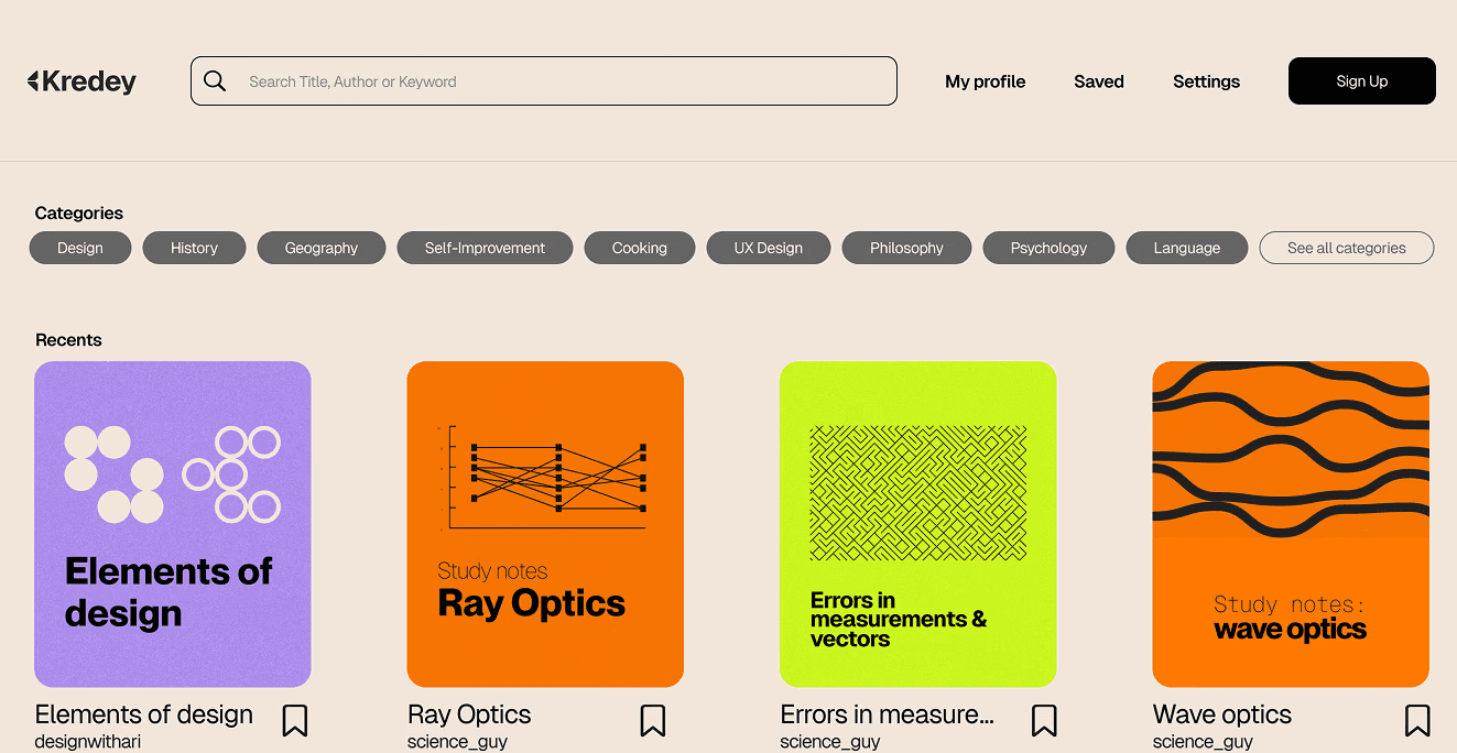
HOME SCREEN
The homepage highlights trending content in a Recents section, with read counts, authors, and estimated reading time for quick scanning.
Bold content cards improve readability, while a bottom navigation bar offers easy access to Home, Search, Following, and Create, keeping the interface intuitive and mobile-first.
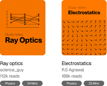
TAGGED CARDS

TAGGED CARDS
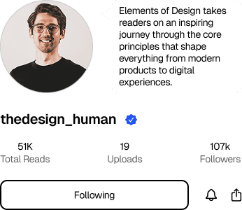
Notes are now tagged by topic (e.g., Physics, Algebra) and estimated reading time, making it easier for students to scan and select relevant material quickly.
The redesigned search screen supports instant filtering by topic, helping users get to what they need without wading through irrelevant results.
UPPLOADING PROCESS
The new upload experience guides contributors through a simple 3-step flow:
Upload notes
View visual analytics on views and downloads
Enable monetization if desired
This redesign removes friction for first-time uploaders and gives professors a clear sense of their content’s impact — while creating an incentive to share more high-quality material.
FINAL DESIGNS
The homepage highlights trending content in a Recents section, with read counts, authors, and estimated reading time for quick scanning.
Bold content cards improve readability, while a bottom navigation bar offers easy access to Home, Search, Following, and Create, keeping the interface intuitive and mobile-first.

HOME SCREEN
35% faster content discovery (based on user tests with search tasks)
01/
Smoother upload experience and regular contributions
02/
Mobile-first design resulted in lower drop-off rates on smaller devices
03/
Increased student trust through clear tagging and author visibility
04/
OUTCOMES
01/ Students struggled with discoverability, often downloading irrelevant or low-quality notes without any preview.
02/ Professors found the upload process confusing and technical, leading to low engagement and poor content tagging.
03/ Mobile users dominated, yet the platform's structure was heavily desktop-oriented.
Reducing cognitive load and designing intuitive, repeatable flows lowered friction and enabled more frequent contributions, helping scale both content volume and quality.
A good product needs strong pathways for discovery. Designing with content visibility and searchability in mind directly impacted user engagement and retention.
For a platform to grow sustainably, all user personas need to see clear value. Building features like analytics and monetization gave contributors skin in the game.
Design is a system of incentives. I saw firsthand how subtle UX choices (like previewing reading time or showing views) can drive contribution, trust, and platform growth.
LEARNINGS
01/ Students struggled with discoverability, often downloading irrelevant or low-quality notes without any preview.
02/ Professors found the upload process confusing and technical, leading to low engagement and poor content tagging.
03/ Mobile users dominated, yet the platform's structure was heavily desktop-oriented.
NEXT
Ensō Village: improving wayfinding and encouraging connections in memory care patients
©2025 by Rhea Pathak Nawaz ☘️